 Friday’s ELP meeting in Sandy (August 9) was well attended and very informative. Steve Ellis once again led our discussion, focusing on ways to make our websites attractive and enticing in order to sell something. He discussed the fact that every website is there to sell something, but initially it is not the site’s product or service – it is simply to spend a little more time on the site. Every website should be designed to first keep a visitor’s attention for 10 seconds, then to spend a couple of minutes. This all has to happen before selling your product or service.
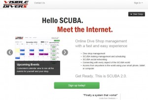
Steve used his Visible Divers website as an example of clean graphics, messaging and fonts. He cautioned using a video as the sole method of describing your service because of varying connectivity capabilities and devices in your market. If site visitors have to wait for a video to load, they will most likely click off the site.
Another very obvious aspect of the Visible Divers site was the repeated and very visible “Call to Action” buttons. His site’s “Sign Up Today!” buttons were green and fairly prominent. They were located at every point where the visitor had to scroll for more content.
Steve introduced some of the latest trends in websites:
1. Big Buttons – meaning “Call to Action” buttons are quite large.
2. Responsive – UI (user interface) designed to fit any screen (mobile, laptop, big screen, etc.).
3. “Flat” – not a lot of color – simple look, not a lot of 3-dimensional-looking icons. Apple has been pioneering the new look.
4. Color palette – use colorschemedesigner.com to get compatible colors. Don’t just guess.
5. Parallax – varying user viewpoint. This is a new user “experience” featuring “single page” designs versus multiple page websites.
6. Single page – all on one page, moving, templates can be purchased.
In addition to these trends, the more attractive sites are now going for smaller logos and fonts are moving away from the old Arial, Times New Roman, and Helvetica in favor of newer styles. Also, according to research, when the human form is in an ad it is more likely to get clicked than other graphics.
Sandy ELP members came away with an understanding that every element of their web pages should be carefully thought out. There should be a pathway toward well-reasoned objectives associated with every graphic, message, color, etc.
